Quick facts
| Type | Self-initiated technical demo — not a client project |
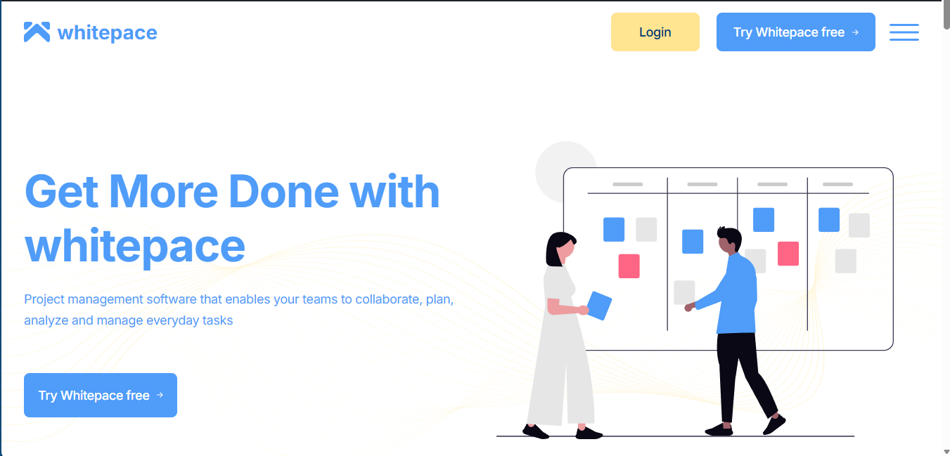
| Source | Third-party Figma file, Whitepace — SaaS Landing Page V2 by Al Razi Siam, CC BY 4.0 |
| Built as | WordPress Classic Theme, zero plugins, zero page builders |
| Scope | All 11 sections, 5 breakpoints (320–1920px) |
| Live demo | demo.noircraftlab.com |
| Code | github.com/noircraftlab/agency-demo-01 (public, GPL-2.0-or-later) |
| Reproducible build estimate | ~28–32 hours for a comparable landing page |
I picked someone else’s polished Figma file and rebuilt it as a production WordPress theme, pixel for pixel. The point wasn’t to design something — it was to prove a specific promise I make to agencies and clients: send me a Figma file, and you get back a fixed quote and a build that actually matches it. No “close enough,” no plugin bloat, no surprises when you compare it against the source.
The Challenge
Most portfolio pieces show off a designer’s own taste. That proves you can design. It doesn’t prove you can faithfully execute someone else’s design under real constraints — inconsistent typography nobody asked you to fix, illustrations you’re not licensed to use, five breakpoints, and a client who will hold your build up against the original frame. I wanted a project that tested exactly that, not a showcase of my own preferences.
My Approach
- Chose real complexity. An 11-section SaaS landing, not a one-pager — and committed to building all of it, no cutting scope to save time.
- Zero dependencies. WordPress Classic Theme, no Elementor, no Bootstrap, no jQuery, nothing beyond Sass for the build step — as lean and portable as a client would actually want.
- Two full pixel-perfect passes, not “responsive enough.” At 1152px and 1920px, text wraps were measured against the exact font instance from the design before a line of CSS was written.
- Handled the licensing gap honestly. Three illustration blocks in the source file were placeholders — the original artwork was separately licensed and couldn’t be redistributed. Filled with open-license illustrations, recoloured to match the design’s palette, credited in the README.
- Documented as I went. A spec written before the build, a changelog through it, and an honest “known trade-offs” section instead of quietly fixing — or quietly hiding — the handful of inconsistencies baked into the source design.
Outcomes
Measured 26 Jul 2026, live demo:
- W3C validation: 0 errors
- Lighthouse desktop: Performance 99 · Accessibility 96 · Best Practices 100 · TBT 0ms · CLS 0.008
- Clean activation on a fresh WordPress install, zero plugins
- All 11 sections shipped — none cut, none simplified
- Reproducible build time for a comparable landing: ~28–32 hours
Known Trade-offs
Three things belong to the original design, not to my build — I reproduced them faithfully instead of “fixing” them, because the brief was to match the design, not improve it: the header navigation uses a different typeface than the rest of the page, one call-to-action button uses a third typeface again, and the footer’s column spacing is inconsistent by a pixel between columns.
One genuine trade-off is mine: decorative underlines drift by roughly 2px from the source frame at a few in-between widths. They’re anchored to the word they sit under, so they survive any line break — rather than sitting at a fixed position that would break the moment the text reflows.
Stack
WordPress Classic Theme · PHP 8.3+ · SCSS (Dart Sass, 7-1-lite) · Vanilla JS (ES6+). Deliberately absent: page builders, CSS/JS frameworks, parent themes.
For Non-Technical Readers
If a freelancer has ever handed you back a site that “mostly” matches the design you approved — spacing that’s a bit off, a font that’s close enough, a mobile view nobody really tested — this is what the alternative looks like: an independent, line-by-line rebuild checked against the original file, with whatever gaps remain named on purpose instead of buried.